PROBLEM STATEMENT
A large number of users were bouncing from the cardio product listing pages, and we needed to increase conversion while reducing drop-offs.
Note for the reader
Had a quick turn around time for this project which meant minimal tech intervention
Spoke to our stakeholders and listened to the calls made by the telesales team.
A note for the
reader
↓
↓
↓
↓
↓
↓
↓
↓
↓
scroll
scroll
scroll
scroll
scroll
scroll
scroll
scroll
scroll
↓
↓
↓
↓
↓
↓
↓
↓
↓
scroll
scroll
scroll
scroll
scroll
scroll
scroll
scroll
scroll
↓
↓
↓
↓
↓
↓
↓
↓
↓
scroll
scroll
scroll
scroll
scroll
scroll
scroll
scroll
scroll
↓
↓
↓
↓
↓
↓
↓
↓
↓
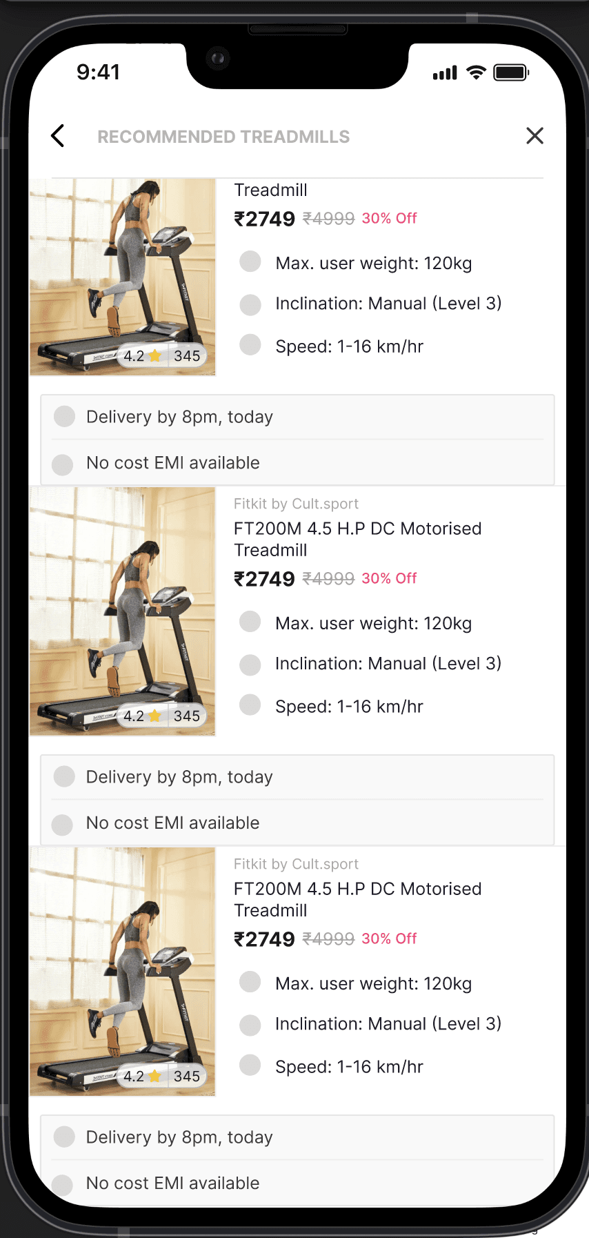
PLP Redesign
Older users buying cardio equipment were often purchasing for the entire household. Because of the higher price point, the decision felt critical and overwhelming. Instead of browsing through dozens of similar options on Amazon, they wanted a simpler way to find the right product.
the challenge!
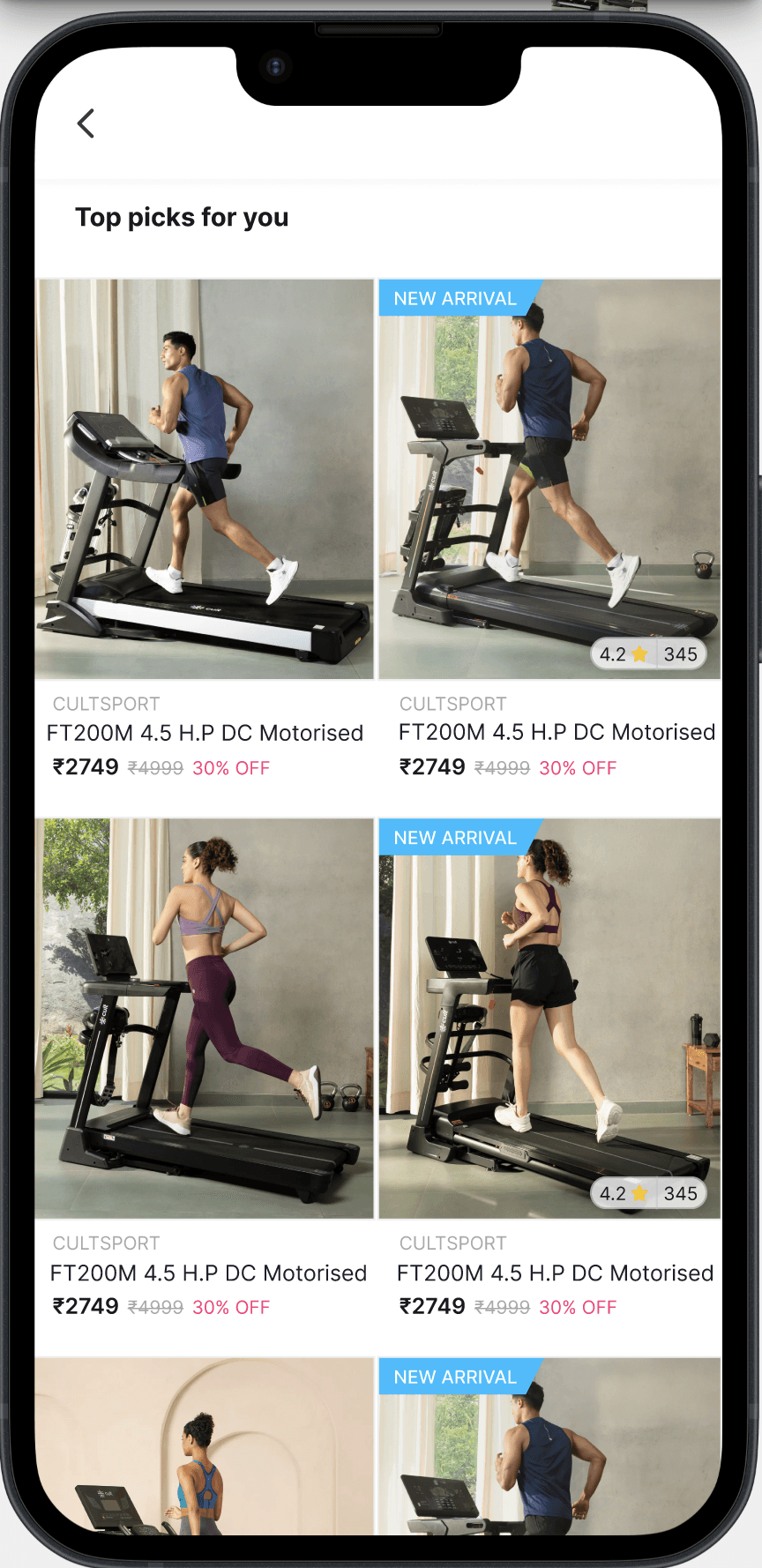
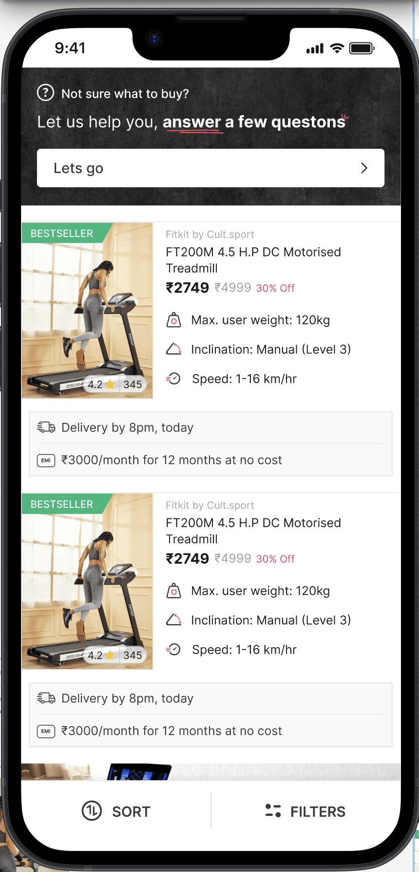
Highlighted key features upfront (speed, incline, price).
Enabled easy side-by-side comparison between treadmills.
Simplified the interface so the experience felt more like expert guidance than overwhelming choice.
the approach
Competitors were using features like
compare, telesales, chat bot to solve the problem.
" transform="translate(3.28 11.845)" width="157.97758389261745px"/><path d="M 0 44.783 C 4.804 44.406 9.883 44.354 14.701 44.527 C 15.857 44.569 28.041 45.411 27.905 44.631 C 27.254 40.891 24.985 37.163 23.689 33.616 C 21.041 26.363 18.84 19.238 18.083 11.53 C 17.705 7.671 17.733 3.828 17.515 0" fill="transparent" height="44.96090838999097px" id="ynWwbtslk" stroke-linecap="round" stroke-linejoin="miter" stroke-miterlimit="10" stroke-width="5" stroke="rgb(255, 255, 255)" transform="translate(150.821 3.29)" width="27.906076080350857px"/></svg>)

we wanted to roll out something simpler faster, so we decided to change how the listing pages looked

Collaborated with the category team to identify which features mattered most to consumers.
Mapped this against the backend data available for each SKU.
Designed a consistent set of feature icons (e.g., speed, incline, cushioning) to highlight key decision-making attributes upfront.


we changed the filters and created an icon library, also highlighted the bestselling sku's in the plp.

Rolled out redesigned Cardio PLP to 50% of users (treatment group).
Compared funnel metrics vs control group.
~55%
Conversion (PLP → Purchase): ↑
5.71% → 6.85%
Add-to-Cart Rate
1.39% → 1.65%
Checkout Initiated: ↑
To follow suit we also experimented with a buying guide for peroformance shoes but it was a failed experiment and we reverted to our existing experience.
Just goes to say users dont have a similar thought process when shopping for shoes, aethetics are often more important


Here's a snippet