Cross-sell charter
Project timeline
7-8 weeks
HATS I WORE
Only designer on the project with a pm
Research, Design, Motion design, Execution, Copy writing

STRATEGY


PROBLEM STATEMENT (what & why)
How might we increase cross-sell of fitness products and increase the organic revenue from our elite users.
Only Elite 15% users shop cult products but are associated to 28% of the cult revenue.
Process for the project
FLOWS WE ATTACKED
1.Onboarding flow
2.Class booking flow
3.Deal of the day
A note for the
reader
This project was quite critical from a conversion standpoint current user base of the elite users were 15% but they accounted for 28% of the d2c revenue. We wanted to increase that percentage. This meant tackling multiple flows accross different user journeys.
To begin with we started with conducting almost 25 telephonic interviews accross different age groups and different user cohorts
“I like seeing what trainers are wearing it makes me want to get the same look.”
“If I’m starting fresh, I want to do it properly. I’d get the right shoes and mat if it helps me stick to my fitness jpurney.”
“Honestly, I didn’t know Cult even sold accessories. I always buy my stuff from Amazon.”
↓
↓
↓
↓
↓
↓
↓
↓
↓
scroll
scroll
scroll
scroll
scroll
scroll
scroll
scroll
scroll
↓
↓
↓
↓
↓
↓
↓
↓
↓
scroll
scroll
scroll
scroll
scroll
scroll
scroll
scroll
scroll
↓
↓
↓
↓
↓
↓
↓
↓
↓
scroll
scroll
scroll
scroll
scroll
scroll
scroll
scroll
scroll
↓
↓
↓
↓
↓
↓
↓
↓
↓
Onboarding flow
01
01
01
01
01
01
01
01
New users only saw Cult as a gym provider.
In interviews, many worked out in cotton tees and defaulted to Amazon/Decathlon for gear.
We wanted to use onboarding to frame Cult as a holistic fitness platform
the challenge!
Our first instinct was to make the onboarding flow educational as a lot of our user's stuck to wearing cotton fabric instead of sweat absorbent fabric.
Benefits of performance wear vs cotton.
But we pivoted to a simpler flow to reduce the friction and excessive cognitive load we'd be giving the user at the very start of their fitness journey
Full walkthrough = risk of friction.
the approach
Version #1
the educational flow
longer scroll too much information
We learned a lot of users do not know how important performance wear is, so as a fitness brand we thought educating them instead of selling
Version #2
the final flow shorter turn around time, reduced tech effort great impact
Learnings
(the experiment was succesful )
The experiment showed strong results, leading to the flow being doubled down and rolled out for the entire month.
Its better to ship simpler designs that might not have all the nuances, then to wait for the all the stakeholders to be onboard with the best design.
137% (12,196 → 28,970)
Daily Run Rate (DRR): ↑
0 → ₹3.65L → ₹8.69L
Monthly Recurring Revenue (MRR):
70%
Impressions: ↑
26%(₹1,234 → ₹1,561)
Average Order Value (AOV)↑
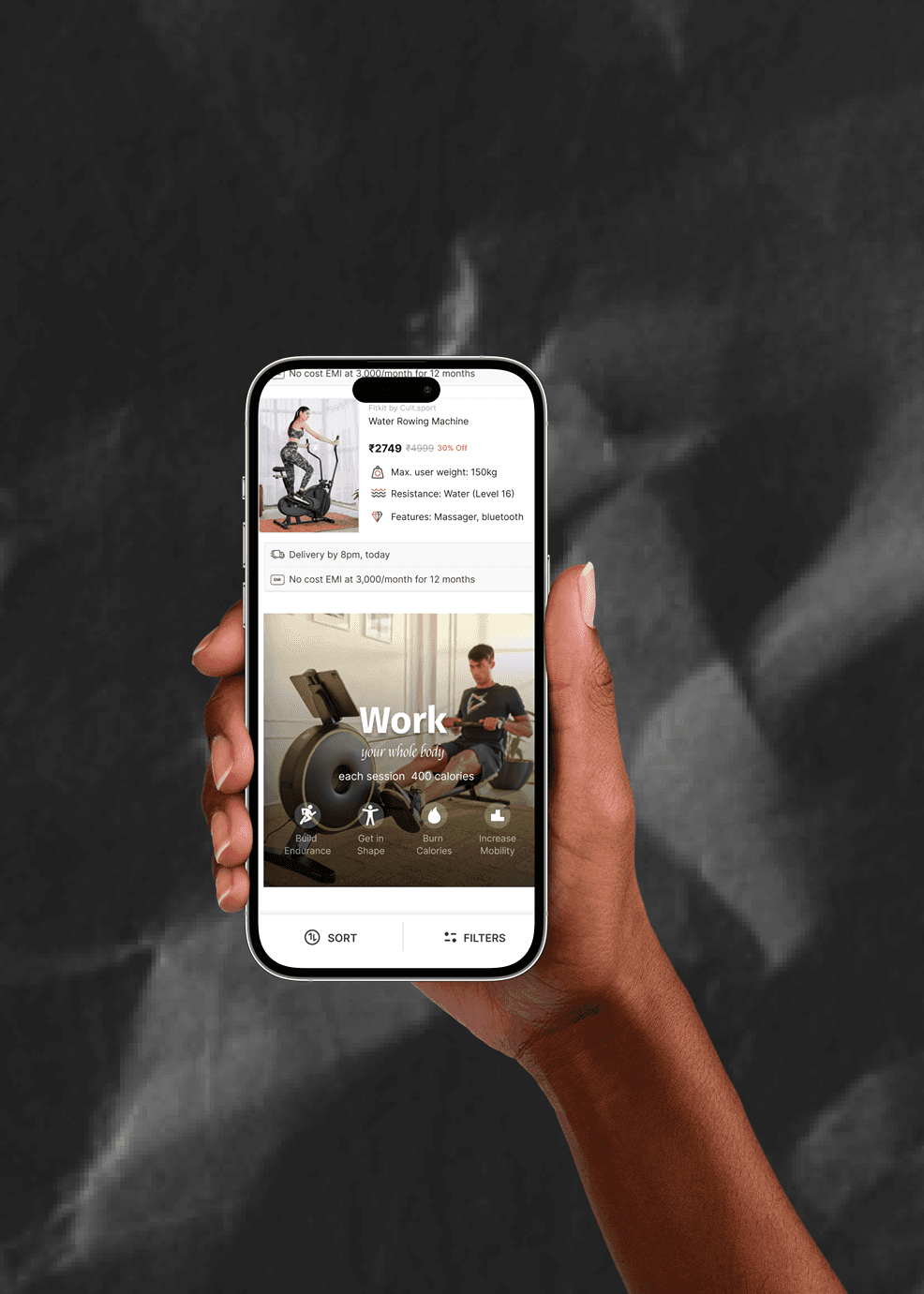
Deal of the day
02
02
02
02
02
02
02
02
The only entry point to the cult store was the bottom nav, there was no way for the user to acess the merch - discounts without clicking on the store.
So to increase the organic user we introduced another entry point where we asked the merch team to introduce heavy discounts for 30 days to increase penetration
the challenge!
Dedicated real estate on the homepage for “Deal of the Day.” So i created a visual library for all articles.
One high-discount SKU refreshed daily — always tied to a product integral to an elite user’s journey (e.g., massagers, shoes, resistance bands).
We didn't have a motion designer's bandwidth so i just learned AFTER EFFECTS to take the project live

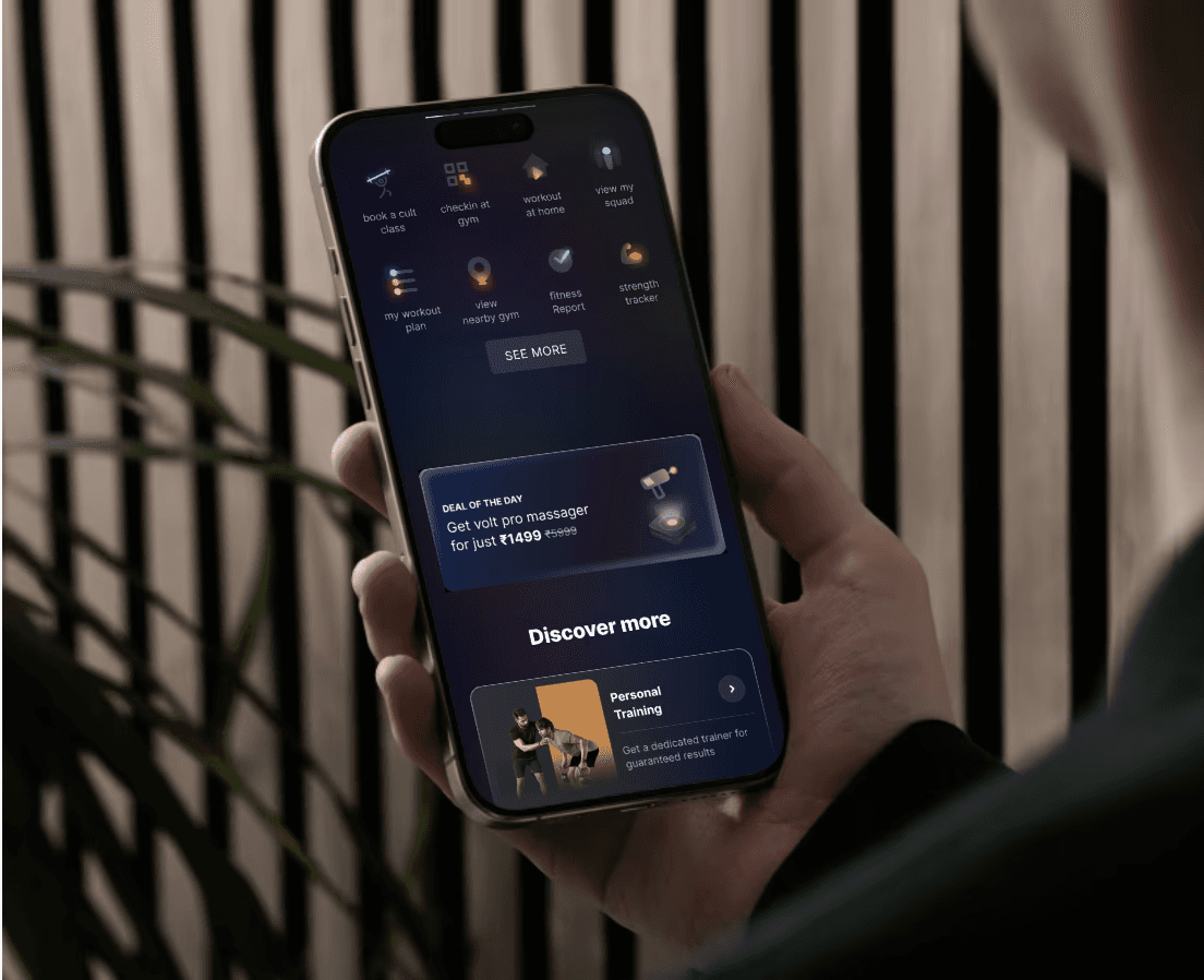
30 days 30 Banners,
to create another habitual entry point
I experimented with different article types, styles to see what worked best with elite users.
Learnings
(the experiment failed )
Even though orders went up, absolute GMV impact was small compared to higher-ticket categories. It didn't make sense for growth to run such high discounts, the delta between the test and control was 65k.
We succeeded in creating the habit we saw a gradual uptick in the number of conversions from DOTD.
56K
impressions,
₹1.62L
Gross Margin Value (GMV)
12.1% highest CTR
CTR on avg around 4
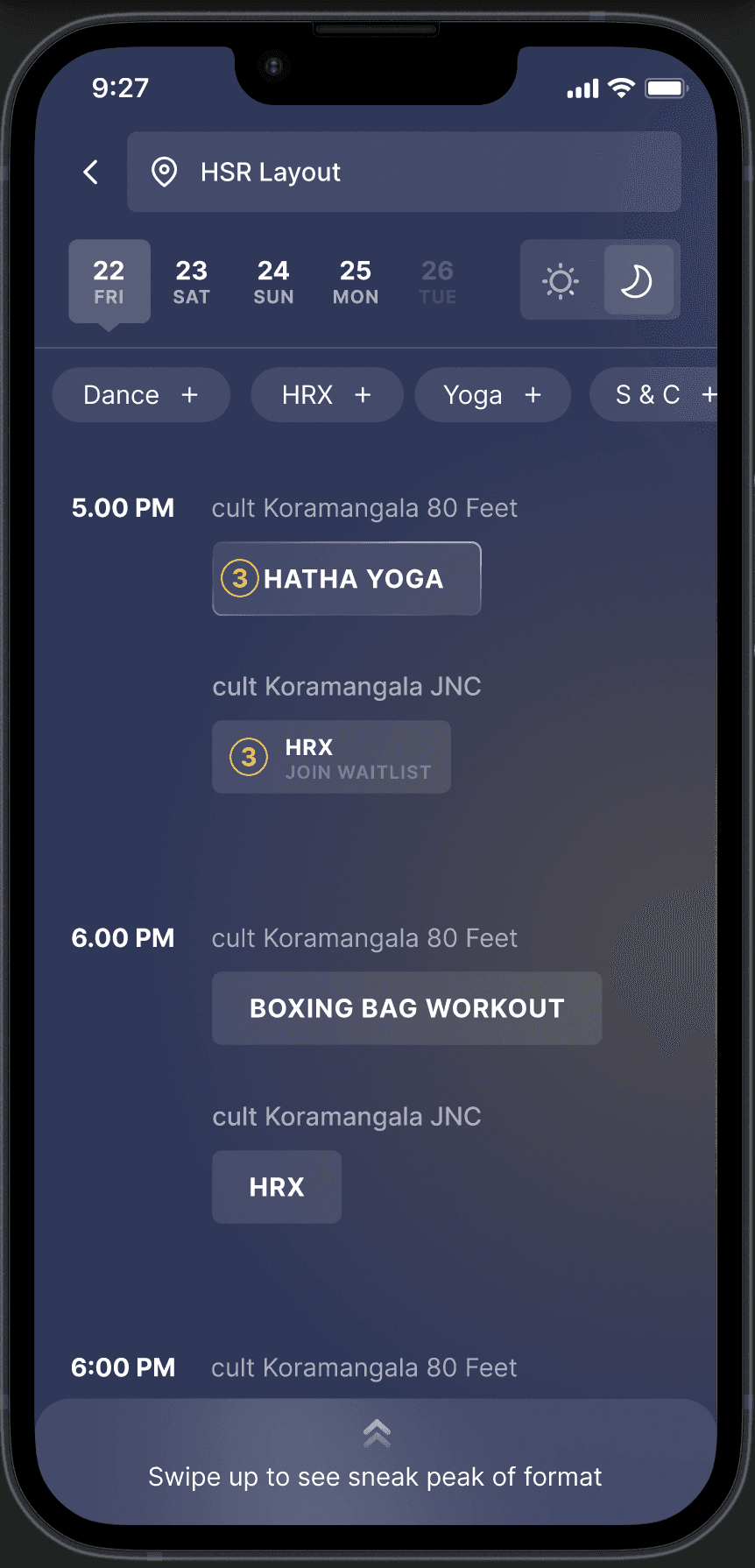
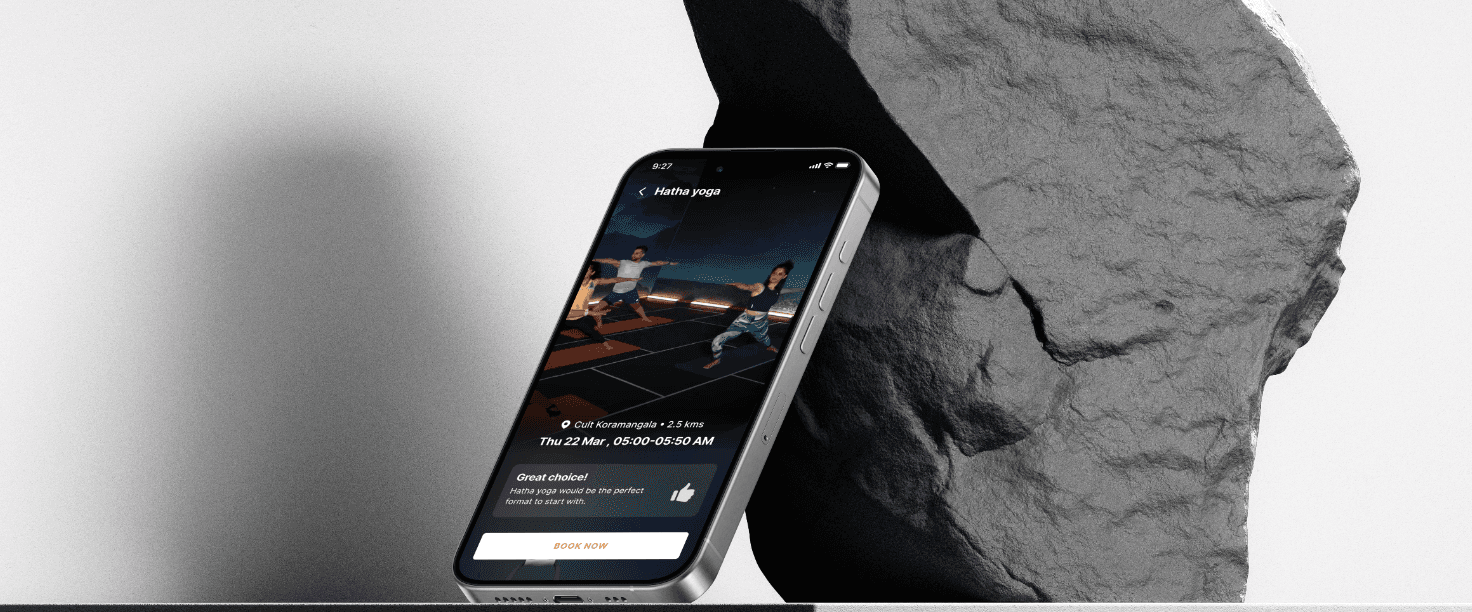
Class booking flow
03
03
03
03
03
03
03
03
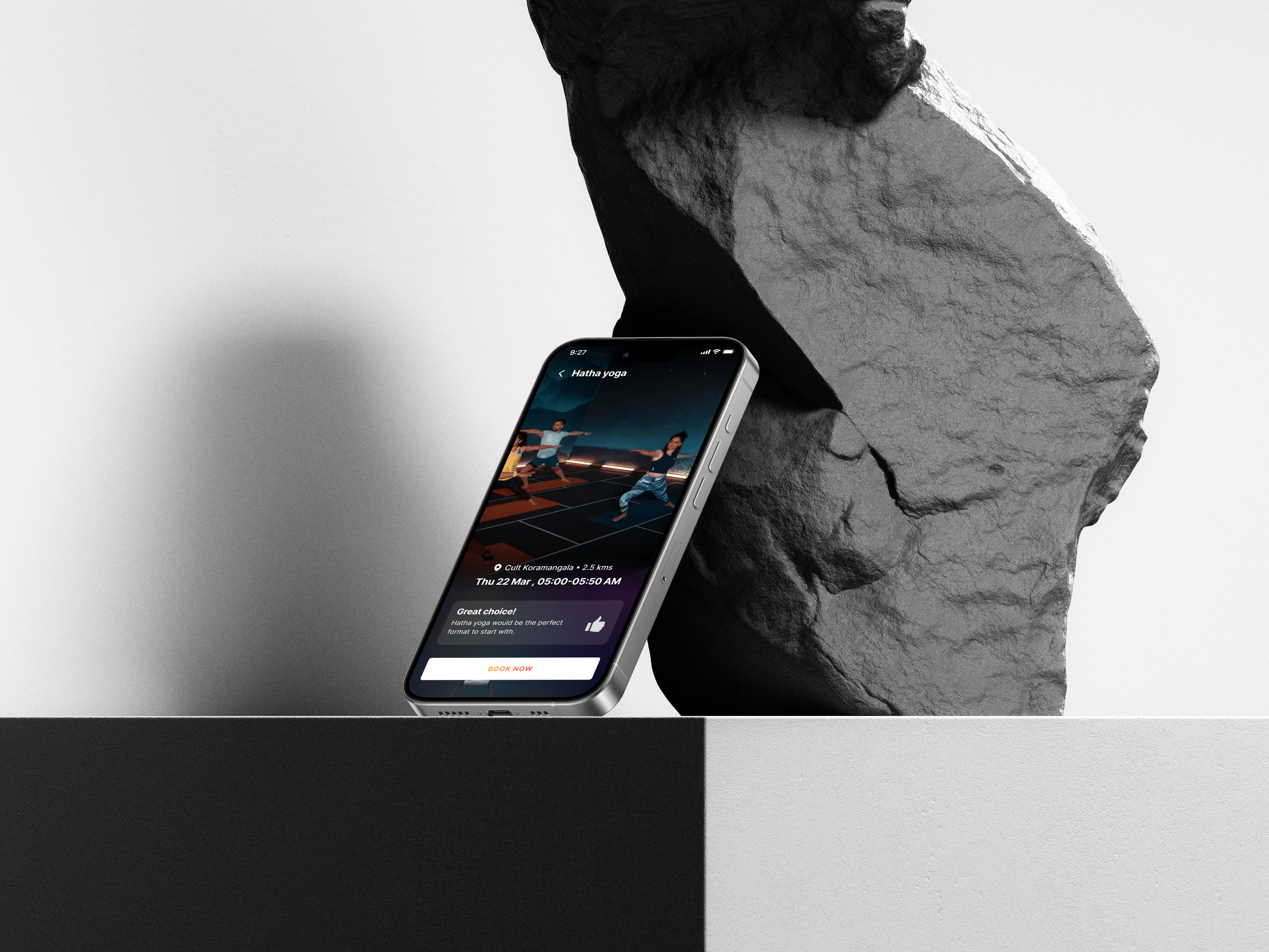
Booking a class is the core intent adding extra steps here would create friction.
“Cross-sell at the right moment, not in the way”
The highest engagement was by the users who used the group workout feature, and after talking to 10+ users i realised that the primary function of the application was the classs booking flow hence making it the most critical flow.
Another observation was that these users often booked 3-4 classes for the week at once, so we had to make sure we didnt make the flow disruptive or it would mean a fall in the user number.
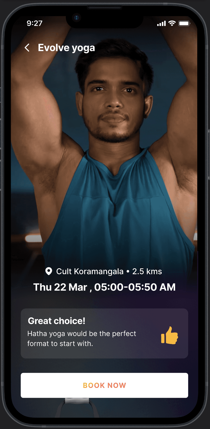
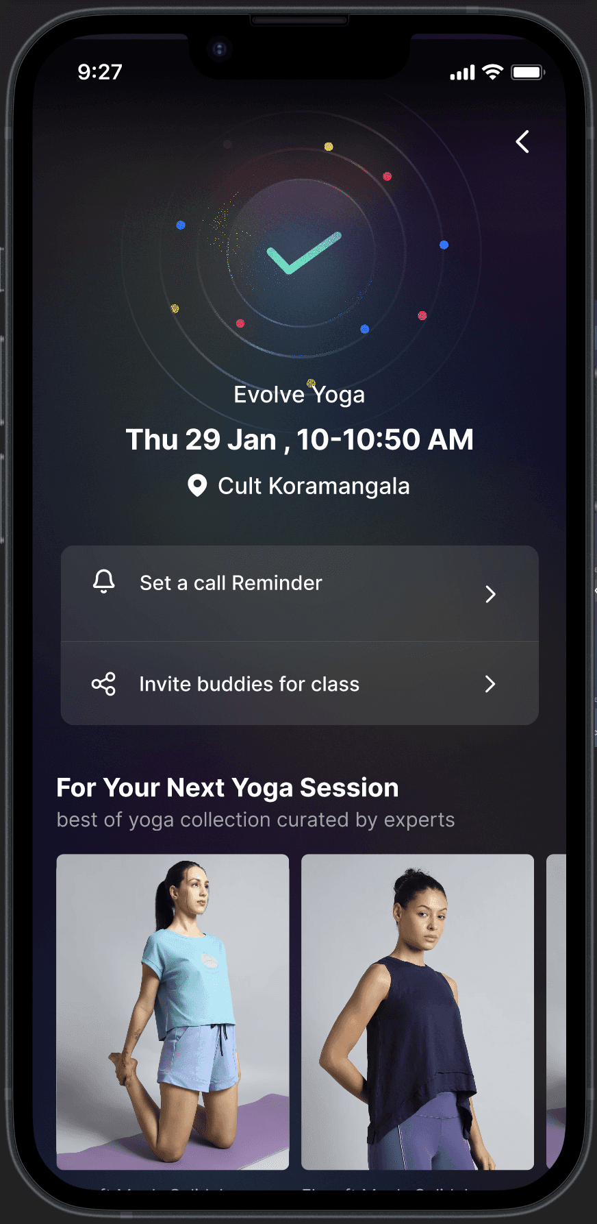
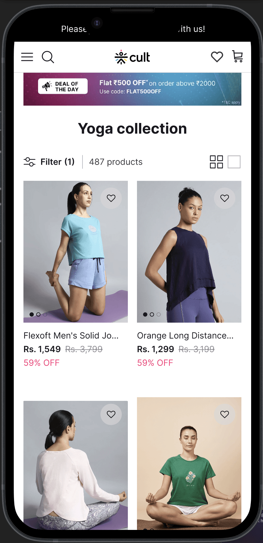
I decided to introduce, product cards and D2c collection page entry points after the class confirmation is done.
The widgets were all based on the users workout collection, for instance a yoga user would only see the yoga collection unless they have had soemthing in the cart and then that'd take the priority.
the key was finding the right touch point for the user and show them targeted products based on relevant workout history
₹3.65L → ₹30L
Incremental sales
Avg 4%
CTR
31%
conversion


Class booking flow
The result of the transformation were immediately visible both in perception and performance studio Vibe reported a 60% increase in client inquiries within the 3 months post-launch. Their social channels saw greater engagements due to the consistent and striking visual language Internally, their team reported a renewed sense of pride and ownership are finally had a brand reflected their passion and ambition. Their pitch decks looked sharper, their proposals more cohesive. The brand now speaks with clarity.
My role
Strategy, Design, sole designer on the project
My role
Strategy, Design, sole designer on the project
What and why
How might we increase cross-sell of fitness products and increase the organic revenue from our elite users.
About
This project was quite critical from a conversion standpoint current user base of the elite users were 15% but they accounted for 28% of the d2c revenue. We wanted to increase that percentage. This meant tackling multiple flows accross different user journeys.
01
01
01
01
01
01
01
Class booking flow
New users only saw Cult as a gym provider.
In interviews, many worked out in cotton tees and defaulted to Amazon/Decathlon for gear.
We wanted to use onboarding to frame Cult as a holistic fitness platform
Redesigned Onboarding flow focusing on capitalising the high enthusiasm when they are onboarded.
137% (12,196 → 28,970)
Daily Run Rate (DRR): ↑
0 → ₹8.69L
Monthly Recurring Revenue (MRR):
70%
Impressions: ↑
26%(₹1,234 → ₹1,561)
Average Order Value (AOV)↑
02
02
02
02
02
02
02
Class booking flow
This is the most critical for cult group class users.
Another observation was that these users often booked 3-4 classes for the week at once, so we had to make sure we didnt make the flow disruptive or it would mean a fall in the user number.
I decided to introduce, product cards and D2c collection page entry points after the class confirmation is done.
The widgets were all based on the users workout collection, for instance a yoga user would only see the yoga collection unless they have had soemthing in the cart and then that'd take the priority.
137% (12,196 → 28,970)
Daily Run Rate (DRR): ↑
0 → ₹3.65L → ₹8.69L
Monthly Recurring Revenue (MRR):
31%
Internal conversion
03
03
03
03
03
03
03
Deal of the day
Dedicated real estate on the homepage for “Deal of the Day.” So i created a visual library for all articles.
1.Onboarding flow
2.Class booking flow
3.Deal of the day
Flows we focused on

Cross-sell charter